Dirah Destination
 1 MonthProject duration
 10 PagesTotal Pages
 TourismIndustry

Bilingual responsive experience
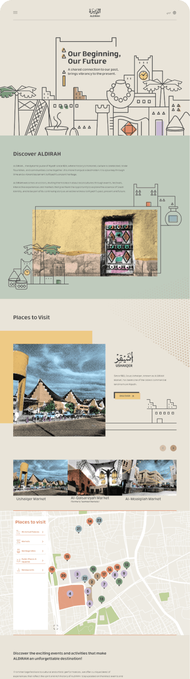
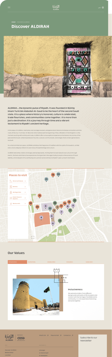
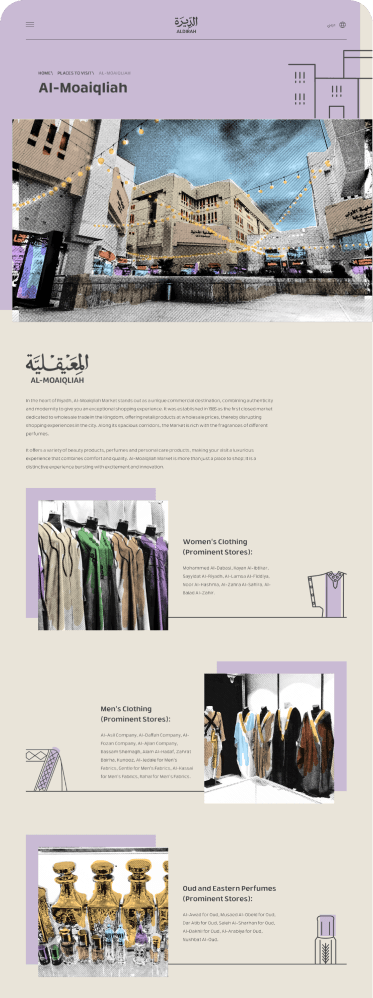
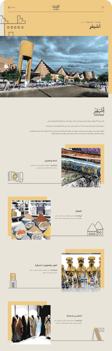
The Dirah Destination website was designed as a fully bilingual experience, supporting both Arabic and English users across desktop and mobile platforms. From the start, both languages were treated as first-class experiences rather than translations layered onto an existing interface.

Arabic & English — Web experience
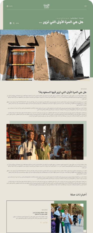
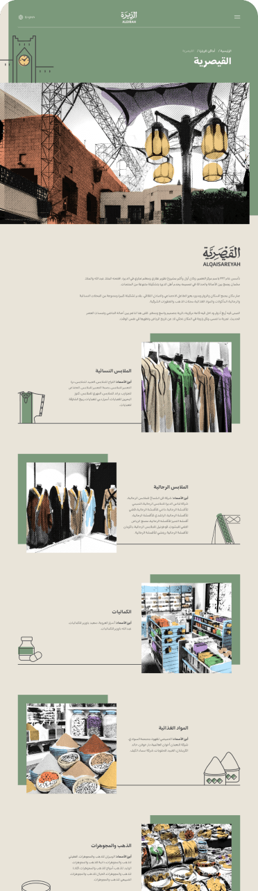
The desktop experience focuses on storytelling and visual immersion. Layouts were adapted to support both left-to-right (English) and right-to-left (Arabic) reading patterns while maintaining a consistent design system. Typography, spacing, and content hierarchy were carefully adjusted to ensure balance and readability across both language formats.

Arabic & English — Mobile experience
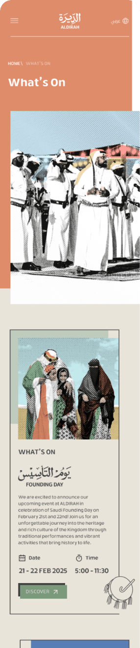
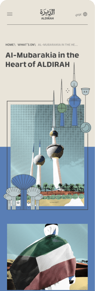
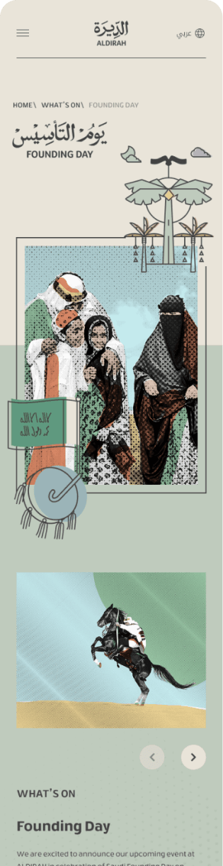
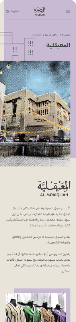
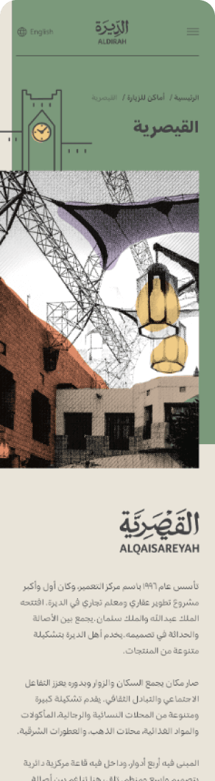
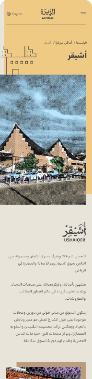
Mobile designs prioritize clarity and ease of navigation for on-the-go users. Content is structured to surface essential information quickly, with touch-friendly interactions and simplified layouts. Both Arabic and English versions retain the same visual identity and usability standards, ensuring a seamless experience regardless of language or screen size.
RTL & LTR design considerations
Special attention was given to directional design challenges. Components such as navigation, icons, alignment, and interaction flows were mirrored where necessary to feel natural in RTL while preserving usability in LTR. This ensured cultural accuracy without fragmenting the overall experience.
Responsive design approach
The website adapts fluidly across devices, maintaining consistency in content, interactions, and visual language. Key experiences—discovering places, exploring events, and navigating the map—remain intuitive across breakpoints, allowing users to switch devices without losing context.
Outcome
The final result is a design-led, bilingual, and mobile-responsive website that delivers a cohesive experience across languages and platforms. By aligning cultural sensitivity with usability principles, the platform supports both local and global audiences with equal clarity and care.

